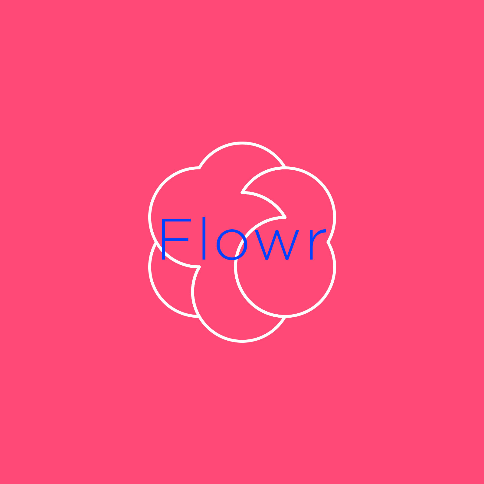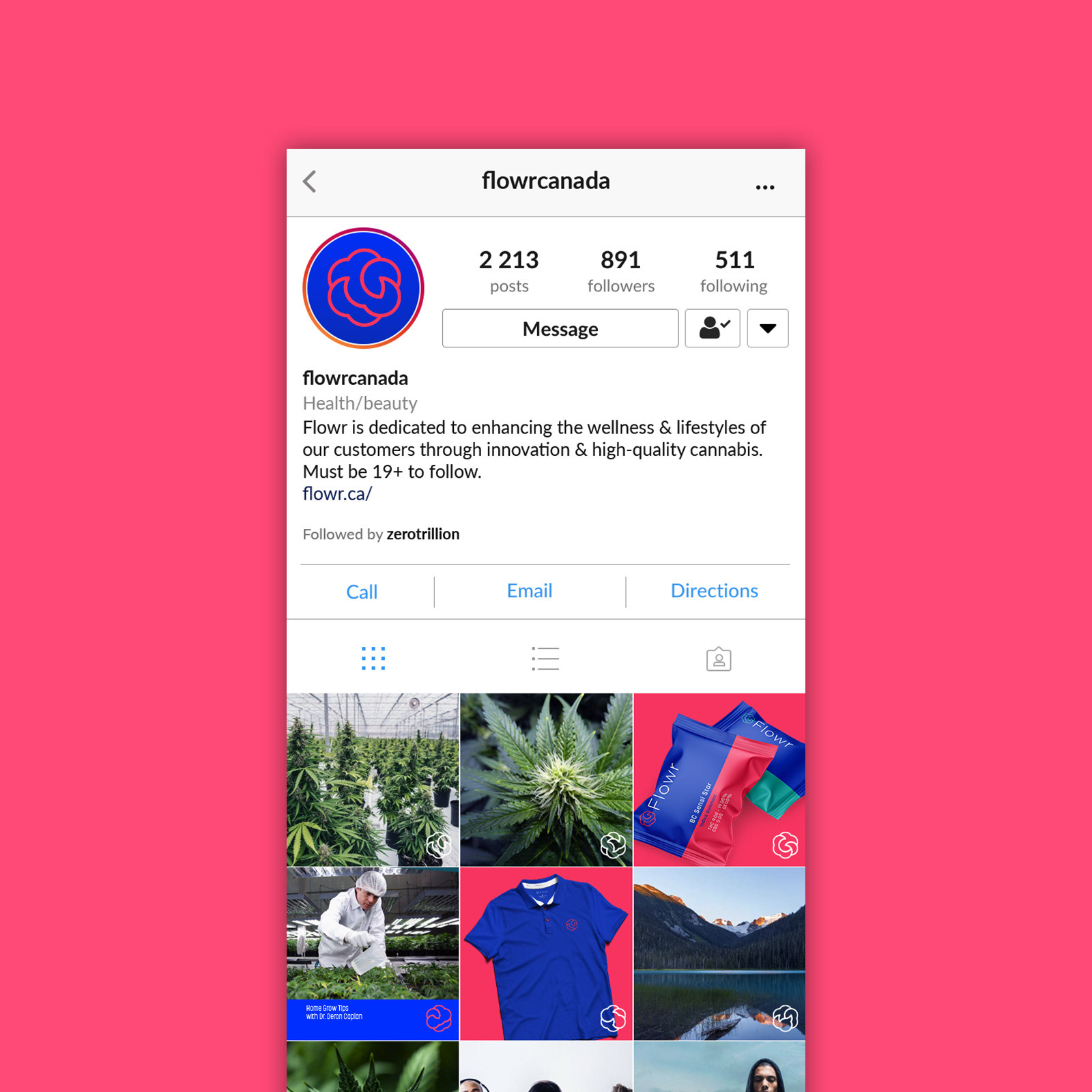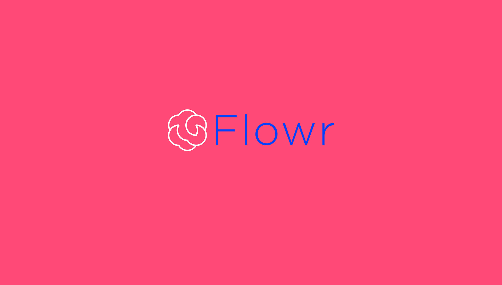
Client: Flowr
Commissioned by: Zero Trillion
Role: Art direction and design
Role: Art direction and design
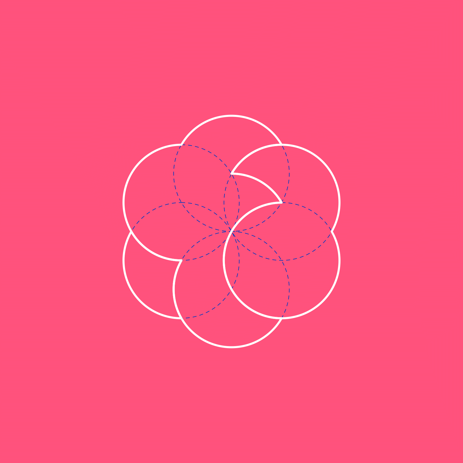
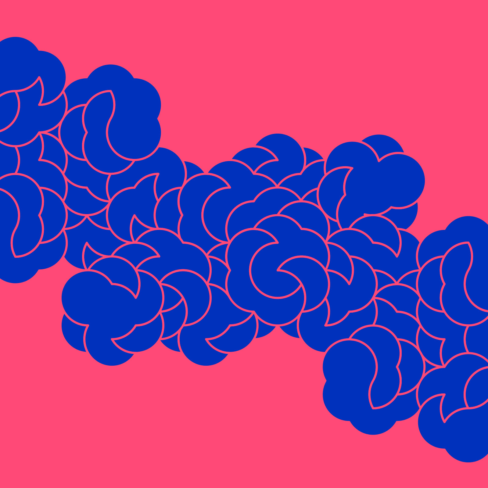
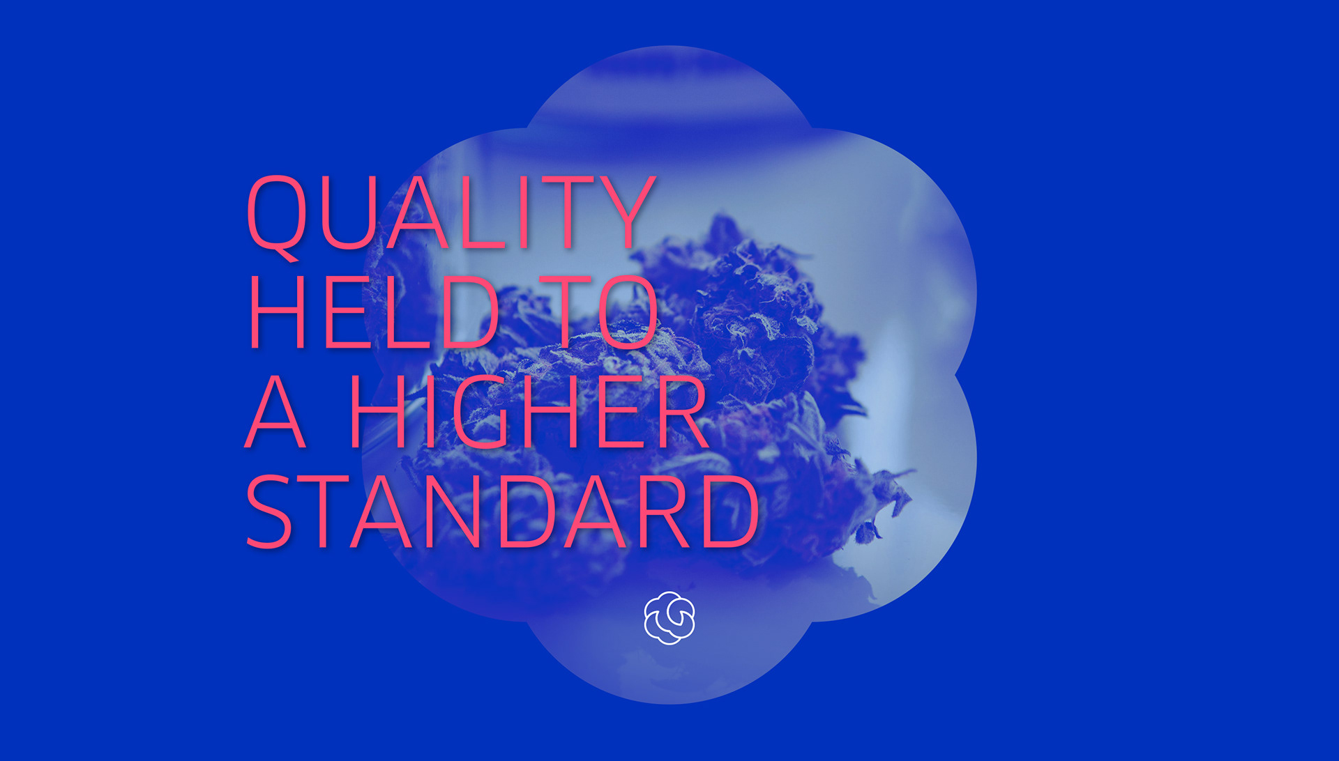
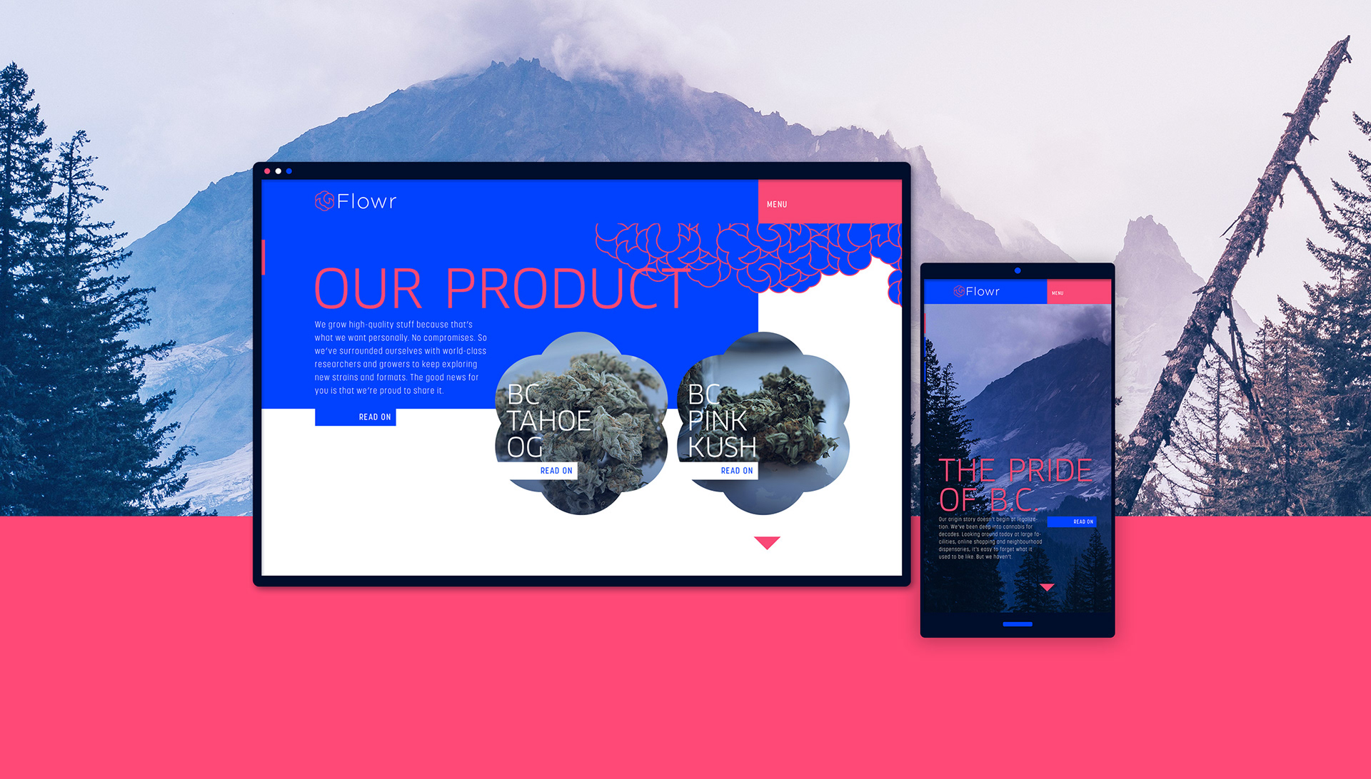
Brief: Brand design for a Canadian cannabis producer who’s USP is in the fact that they are very scientifically grounded in the producing a highly accurately balance product to appeal to a serious cannabis user. Grown in a lab to cater to specific needs and preferences.
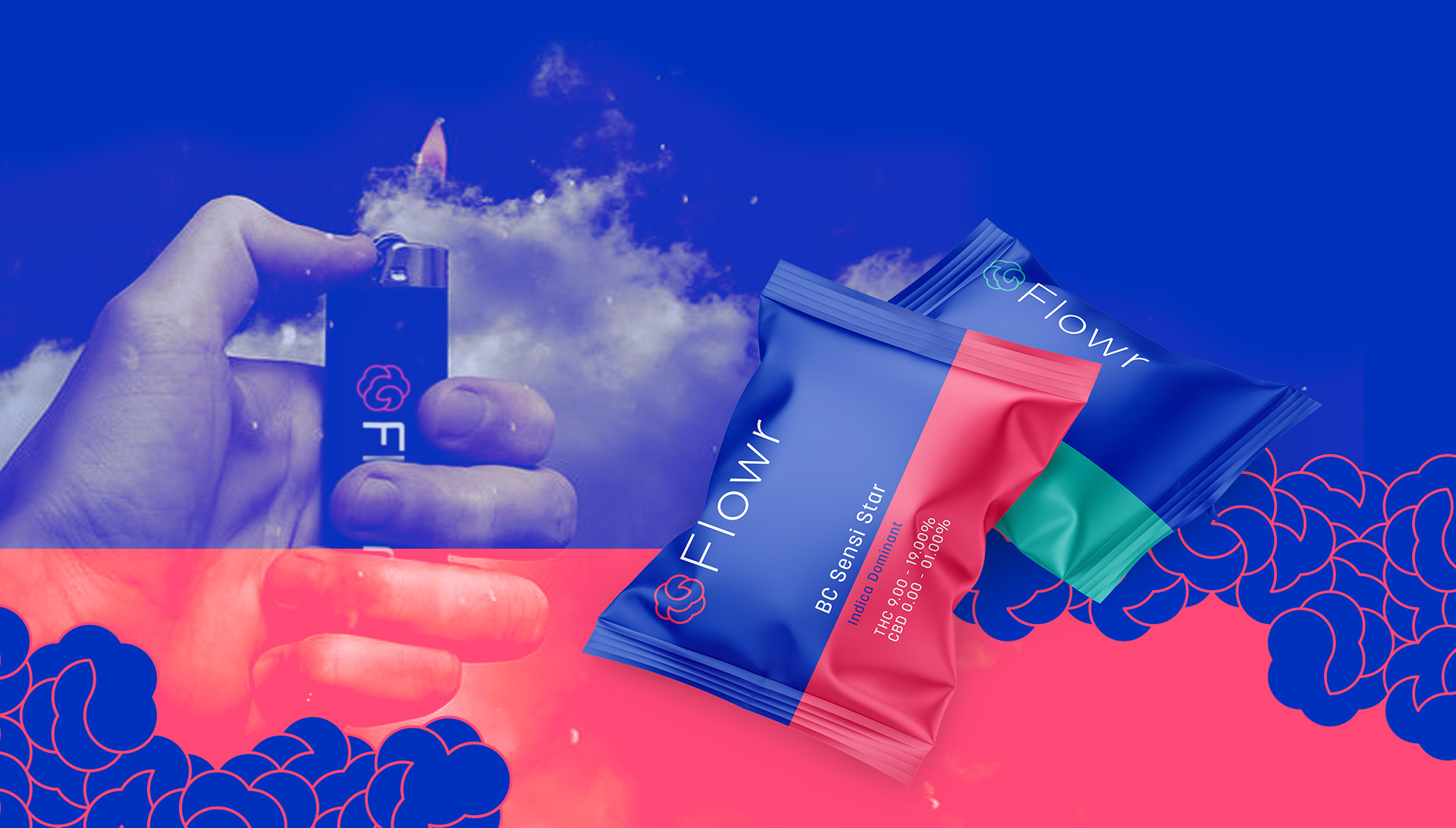
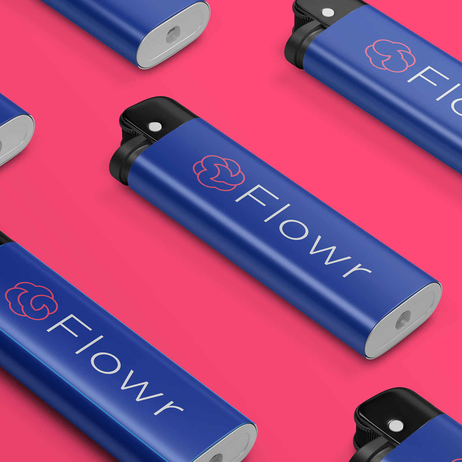
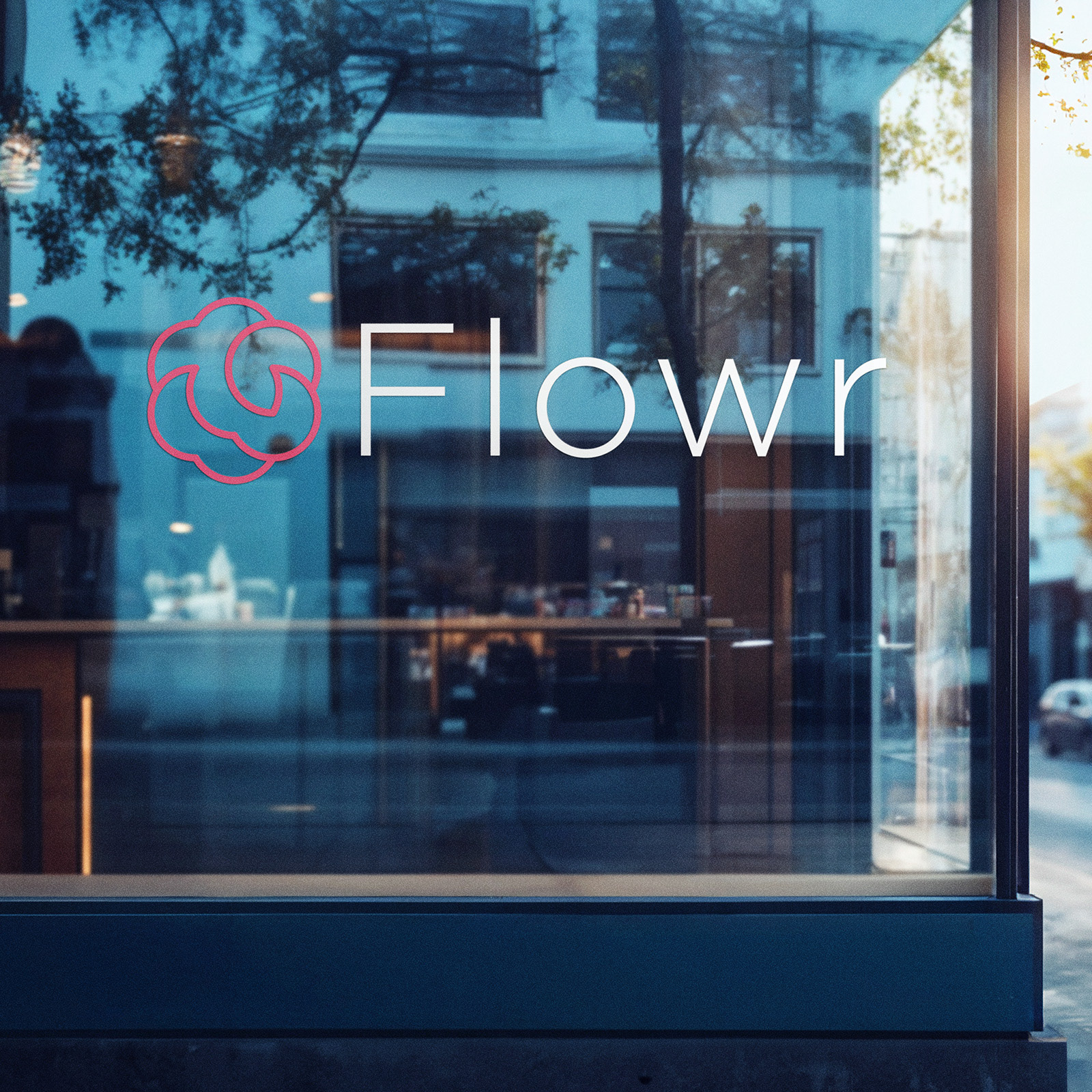
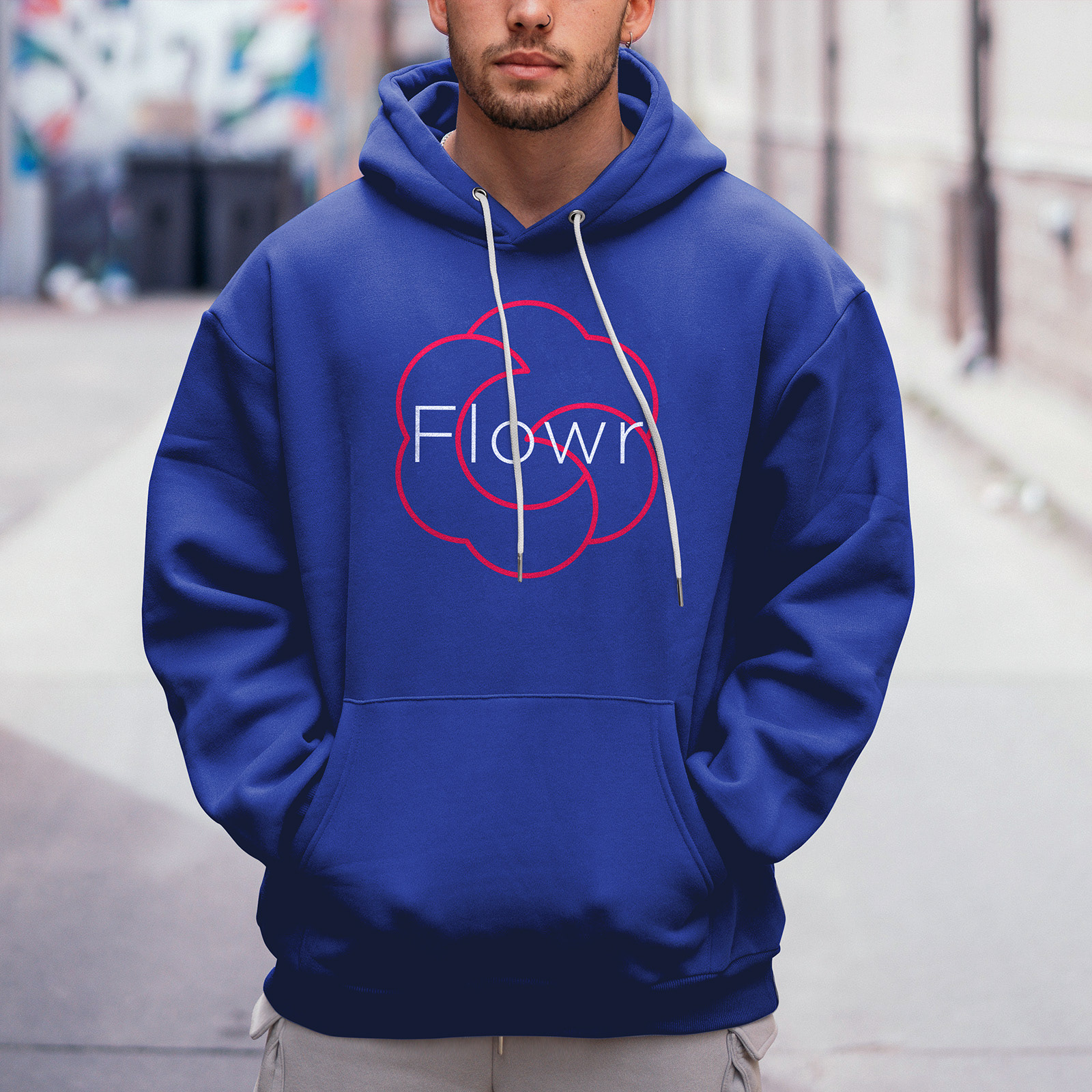
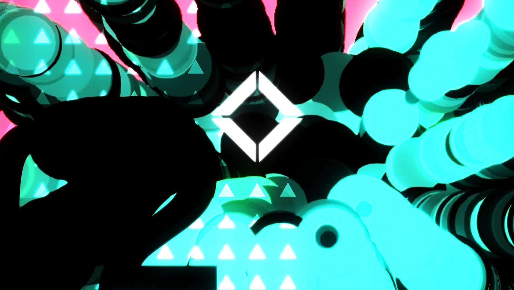
Solution: A style that is both clean or scientific and organic at the same time. A variable logo mark resembling both a flower and a puff of smoke in a colour palet that is modern, almost clinical as much as it is trippy due to the intentional colour vibration between the blue and the pink.