Commissioned: Being There
Role: Art direction and design
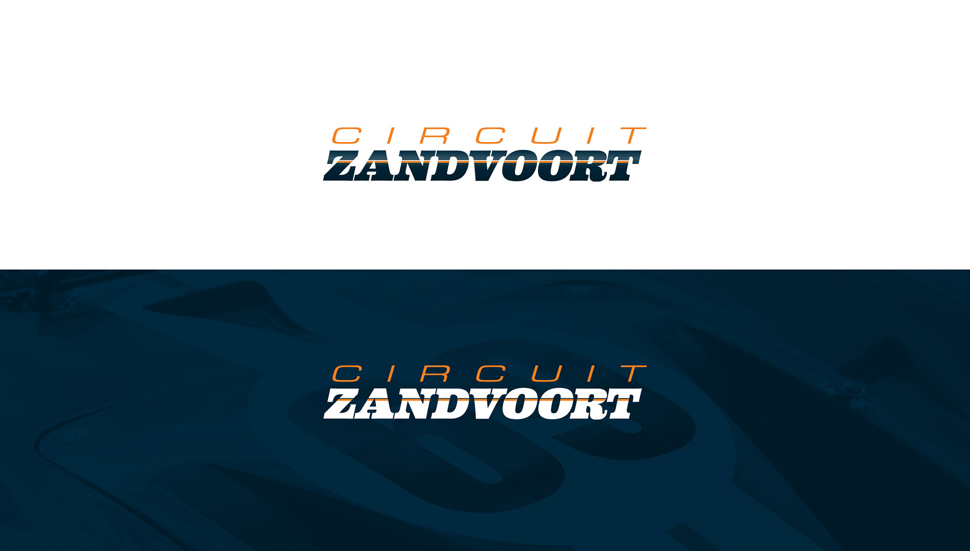
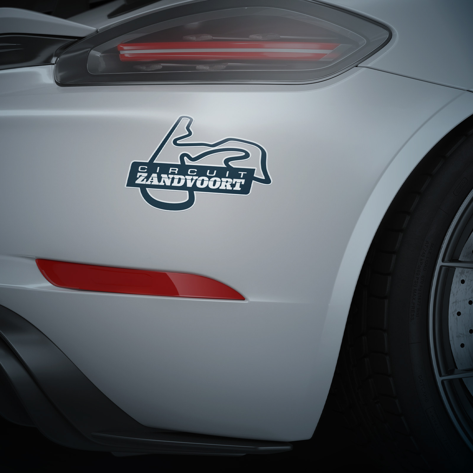
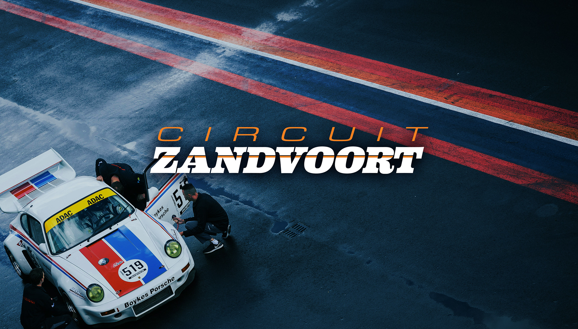
Brief: Redesign and modernise the visual identity for the Netherlands’ most legendary race track. Raising its brand profile to a F1 level standard. A brand identity that sparks a sense of excitement and wonder without losing the sense of the track’s rich heritage in racing.
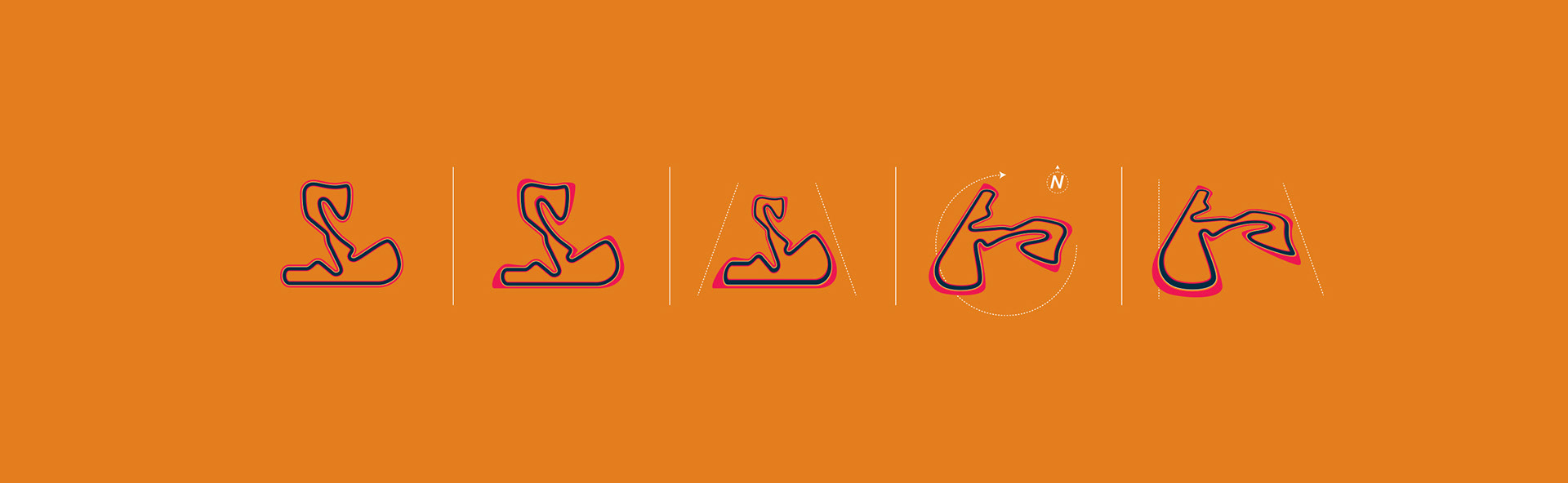
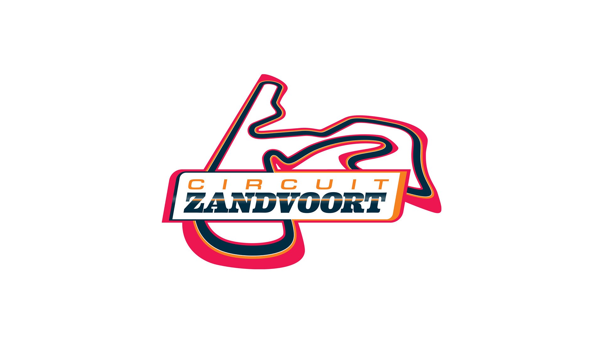
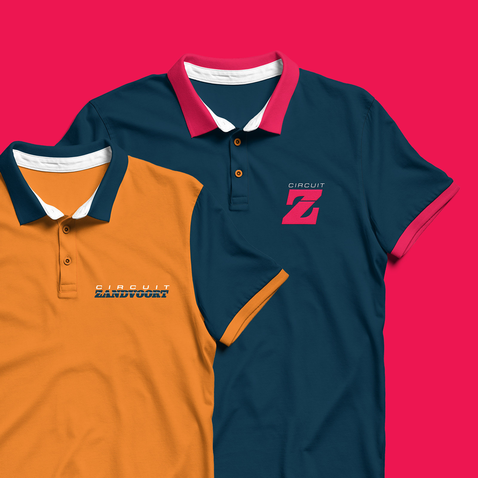
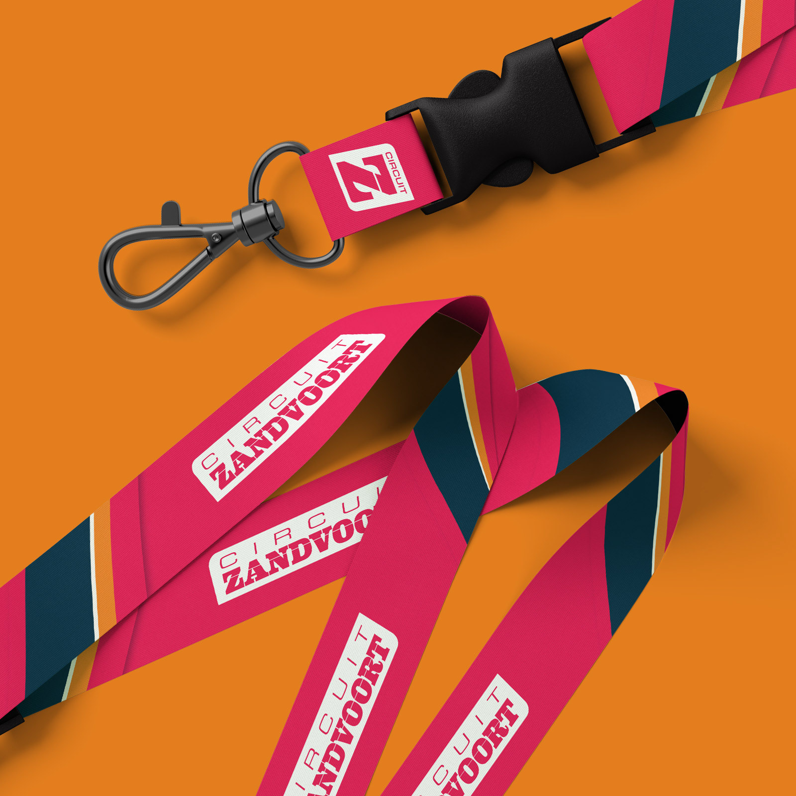
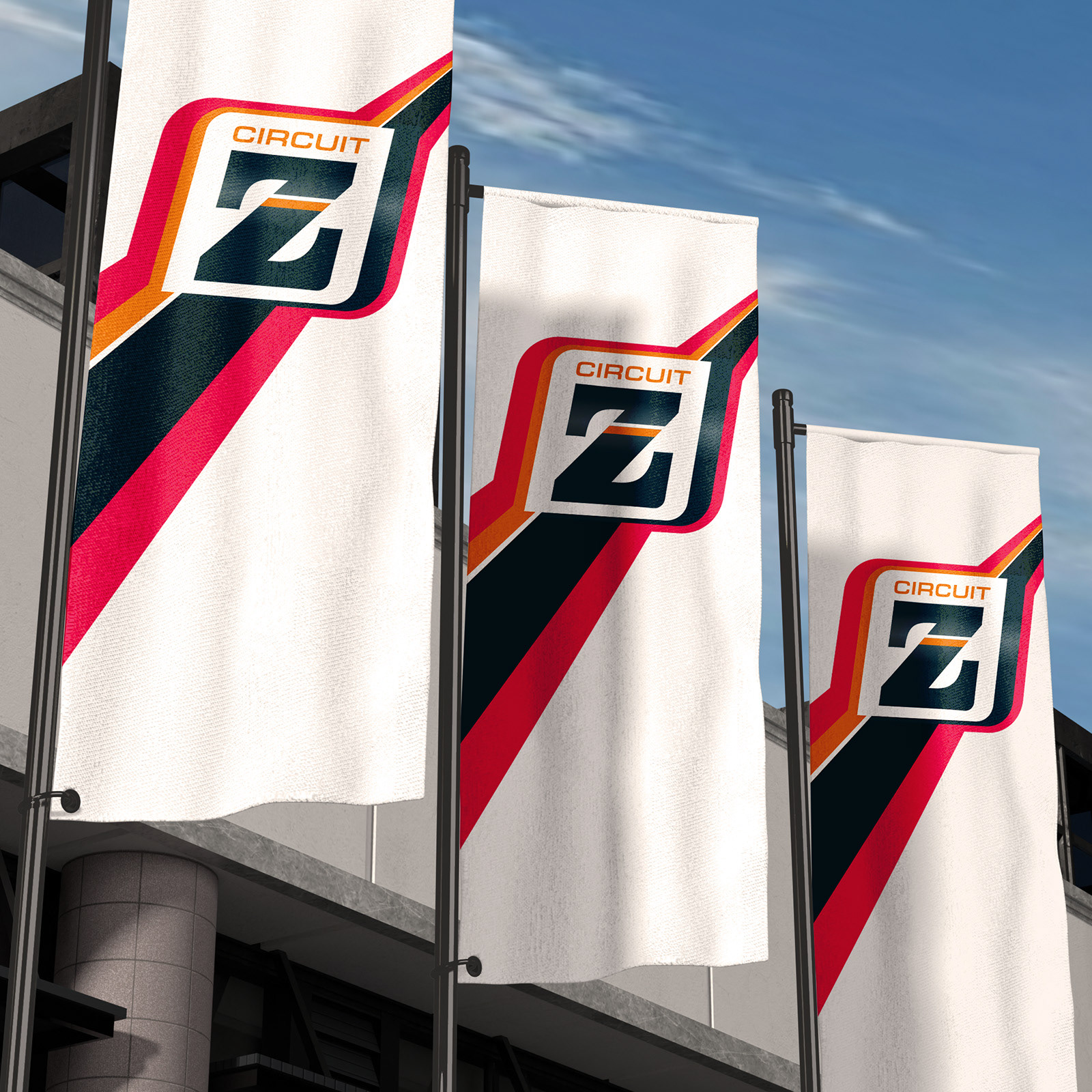
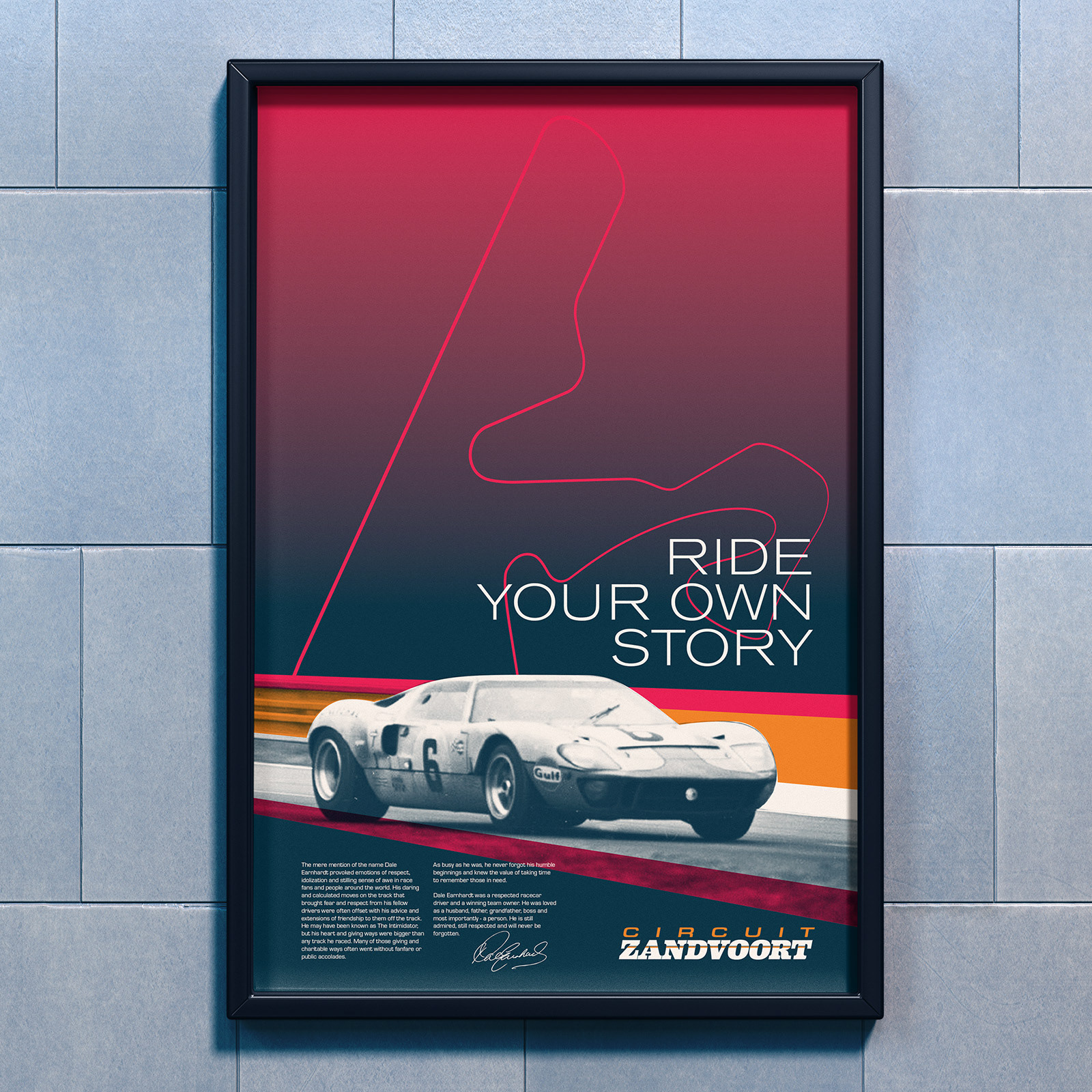
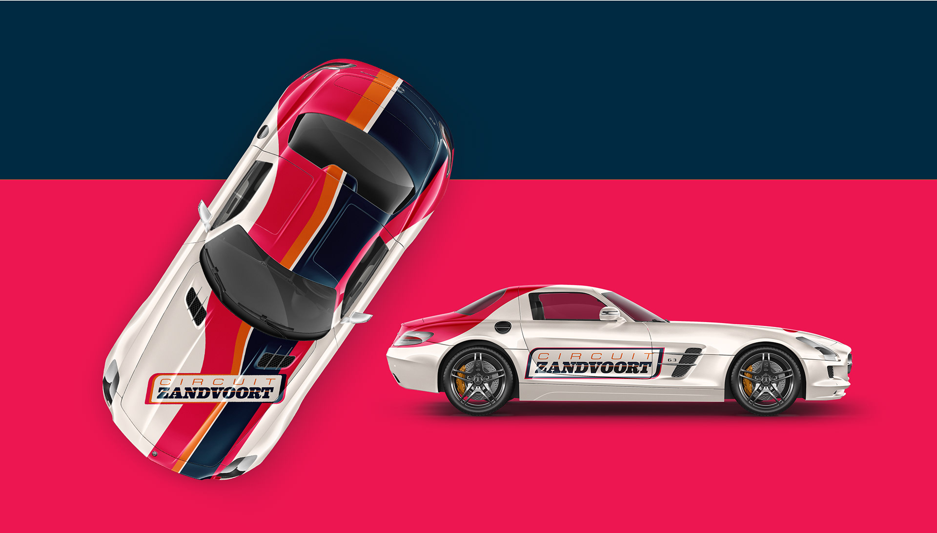
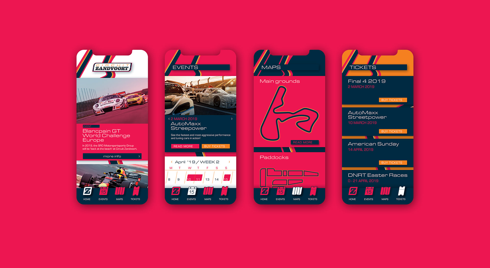
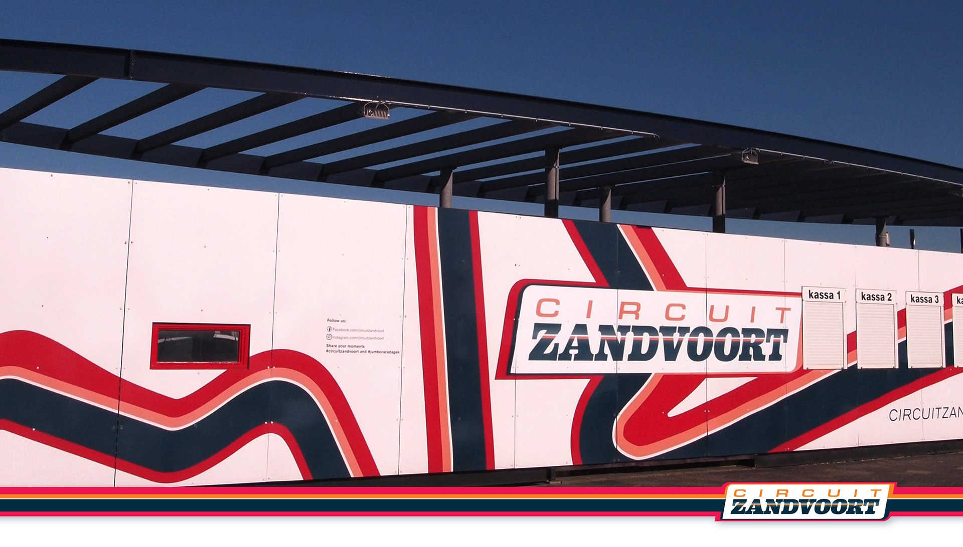
Solution: A style was developed based on the idea of striping patterns commonly used in racing. How they convey speed and power and also function as a visual metaphor for the track and other features of Circuit Zandvoort.
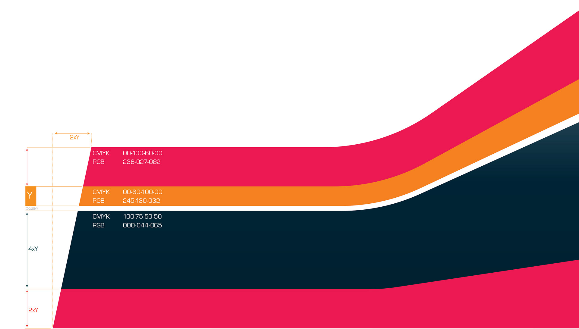
The colours represent the the tarmac and rubber in the dark blue. The orange hints at the Dutch heritage, but also the beach that the main straight of the track runs parallel to. And the magenta red adds the excitement of a day at the races.
The colours represent the the tarmac and rubber in the dark blue. The orange hints at the Dutch heritage, but also the beach that the main straight of the track runs parallel to. And the magenta red adds the excitement of a day at the races.