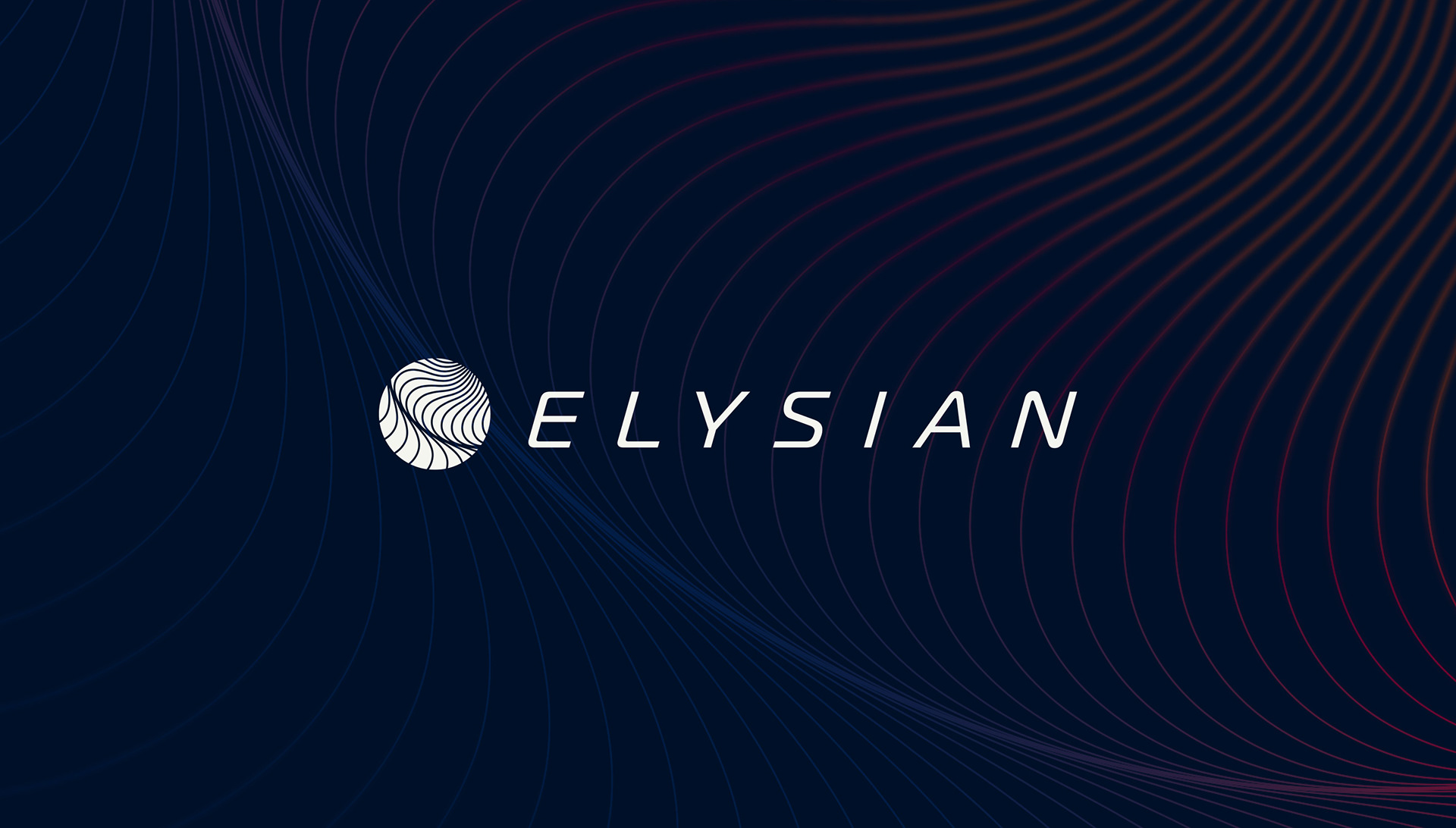
Client: Elysian Avation
Role; Brand strategy, art direction and design.
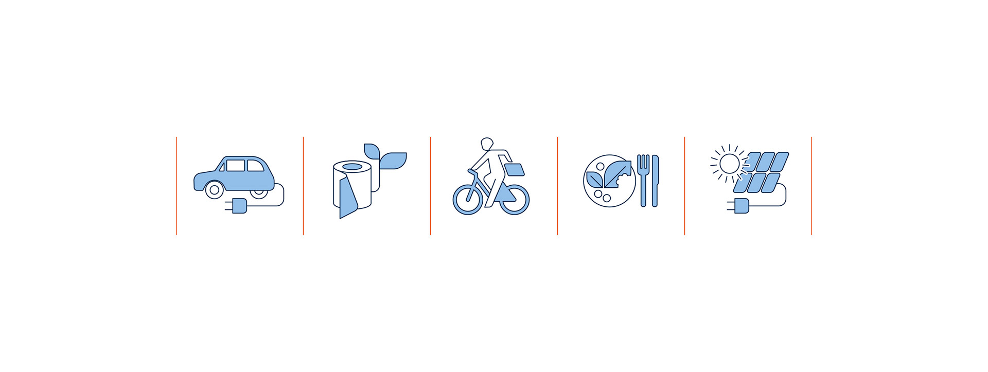
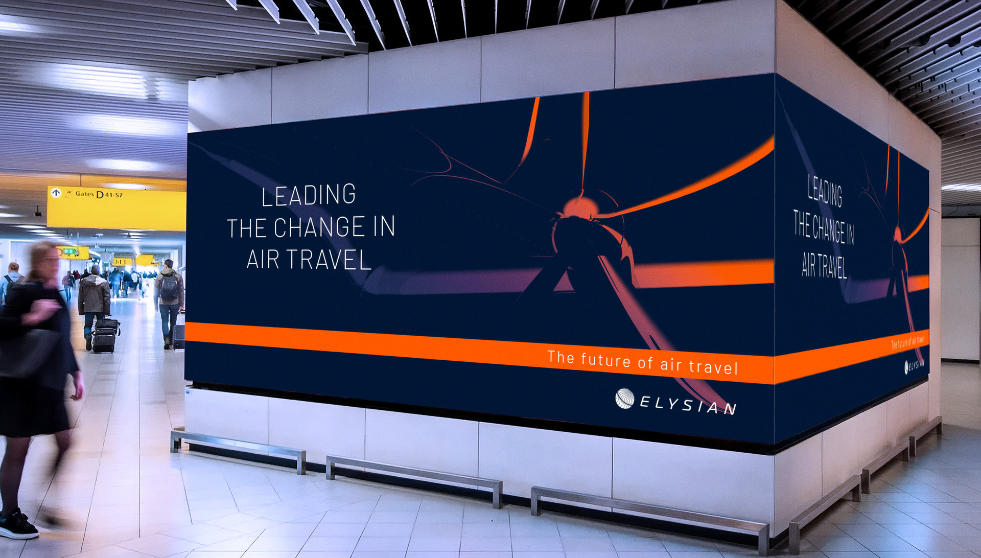
Brief: Elysian Aviation is innovating the aviation industry by building aircraft for long distance battery electric flight. It is a courageously innovative company but by no means a new kid on the block. As a daughter company of Fokker, it is taking on the conventional mammoths of the industry with sharp science-based innovation and a century worth of aviation know-how. Our challenge was to not only highlight the future focused bold aspects of Elysian’s work and mindset, but also show that it was based on a large wealth of knowledge and heritage.
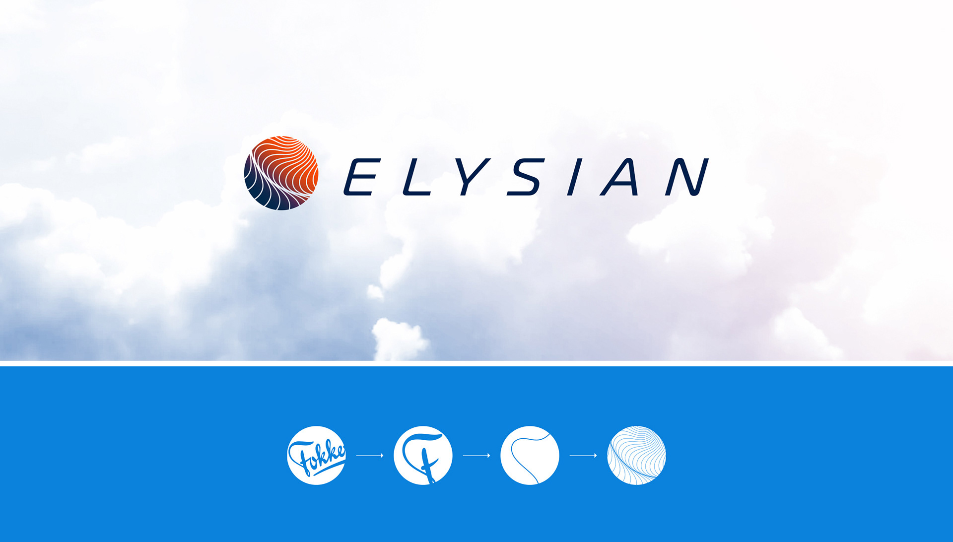
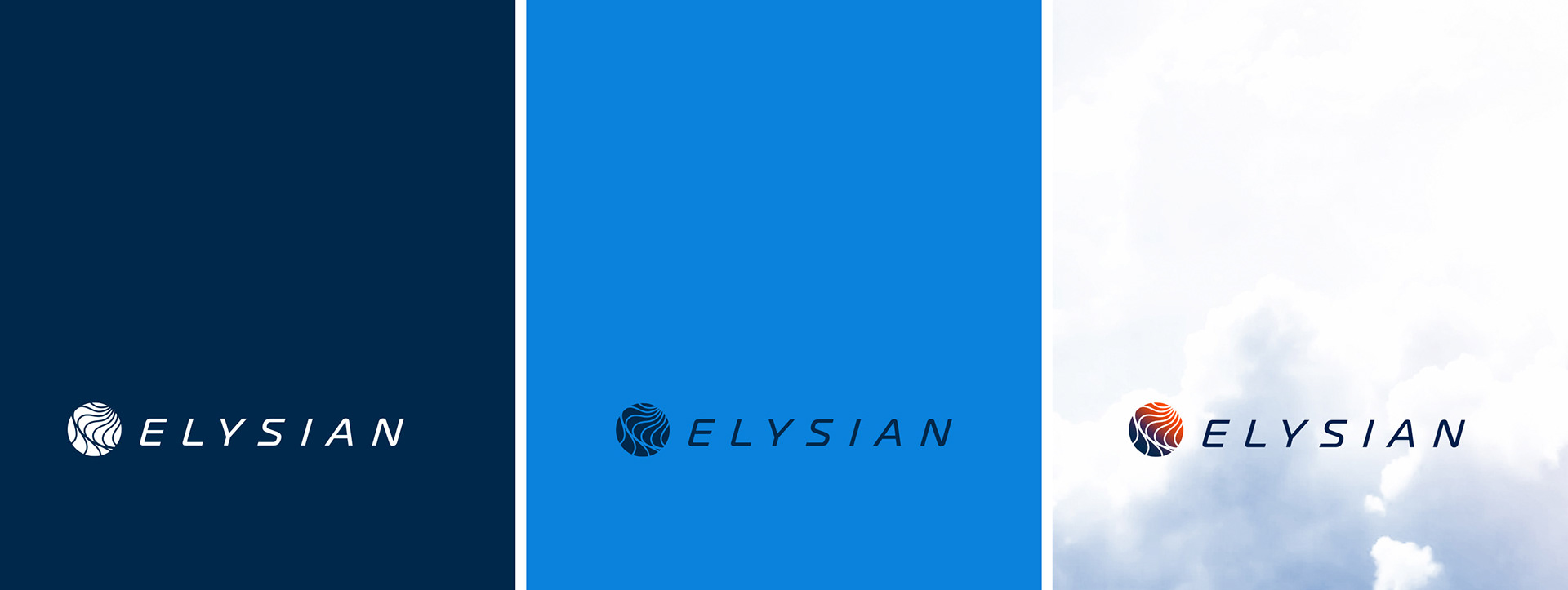
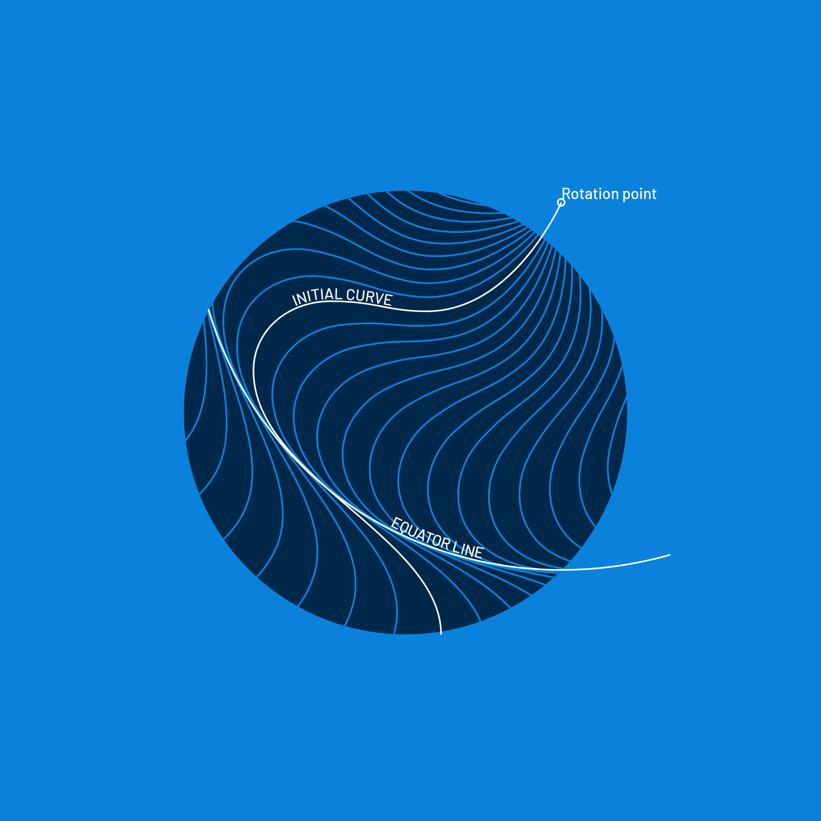
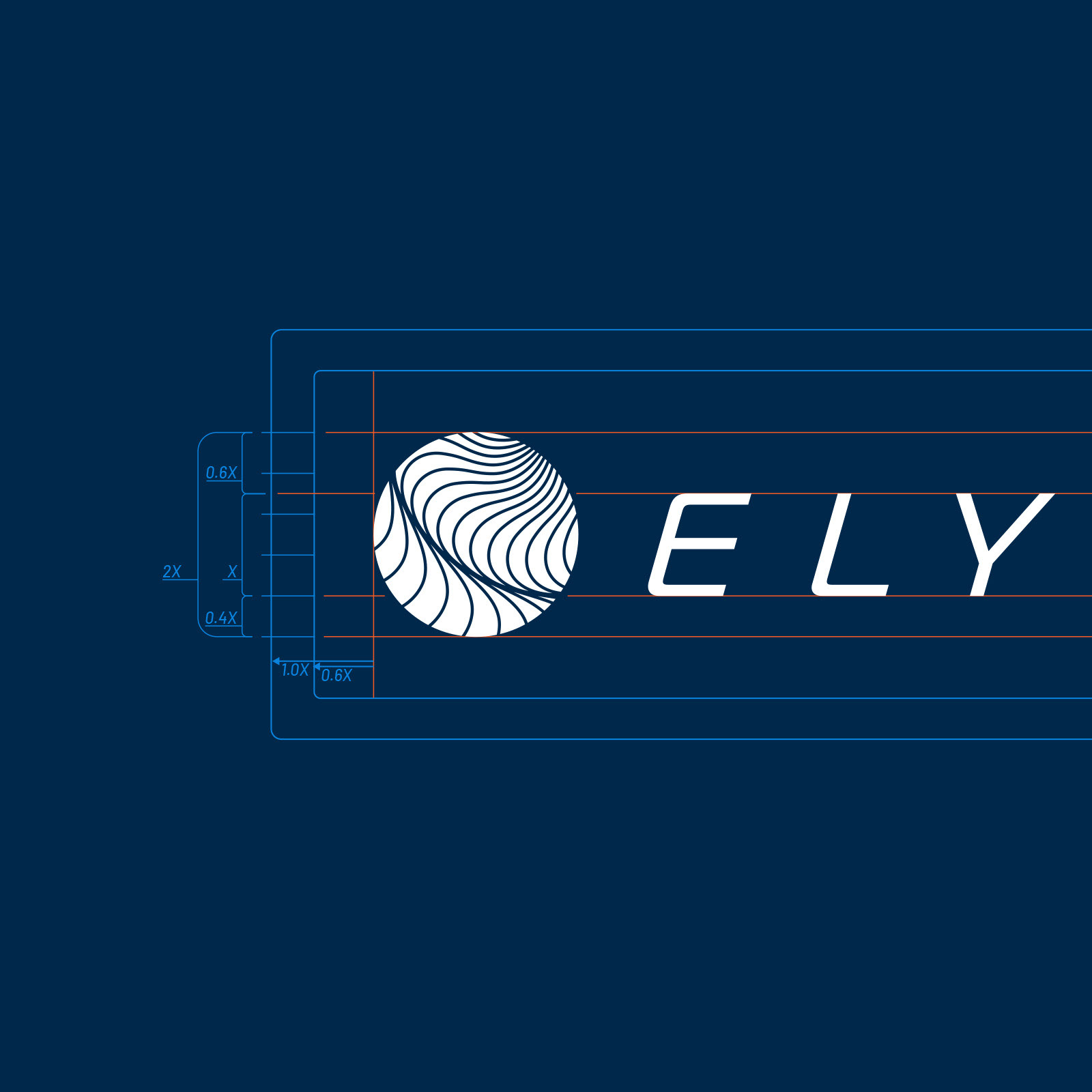
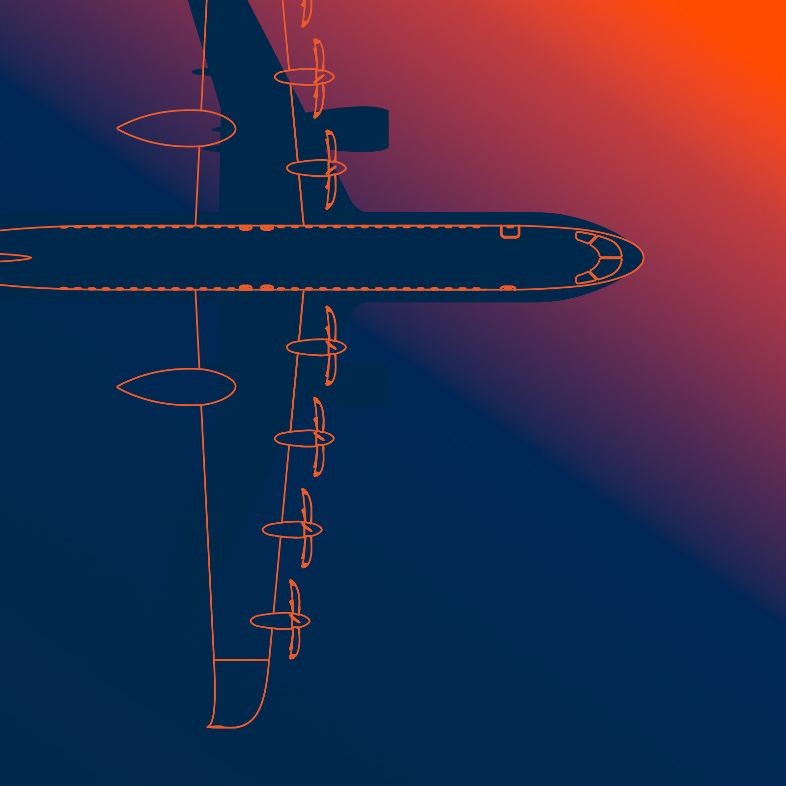
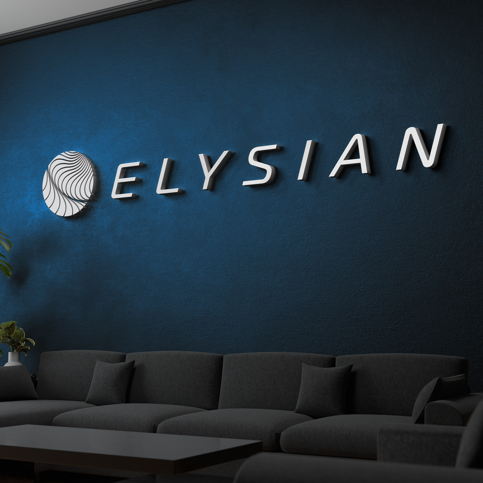
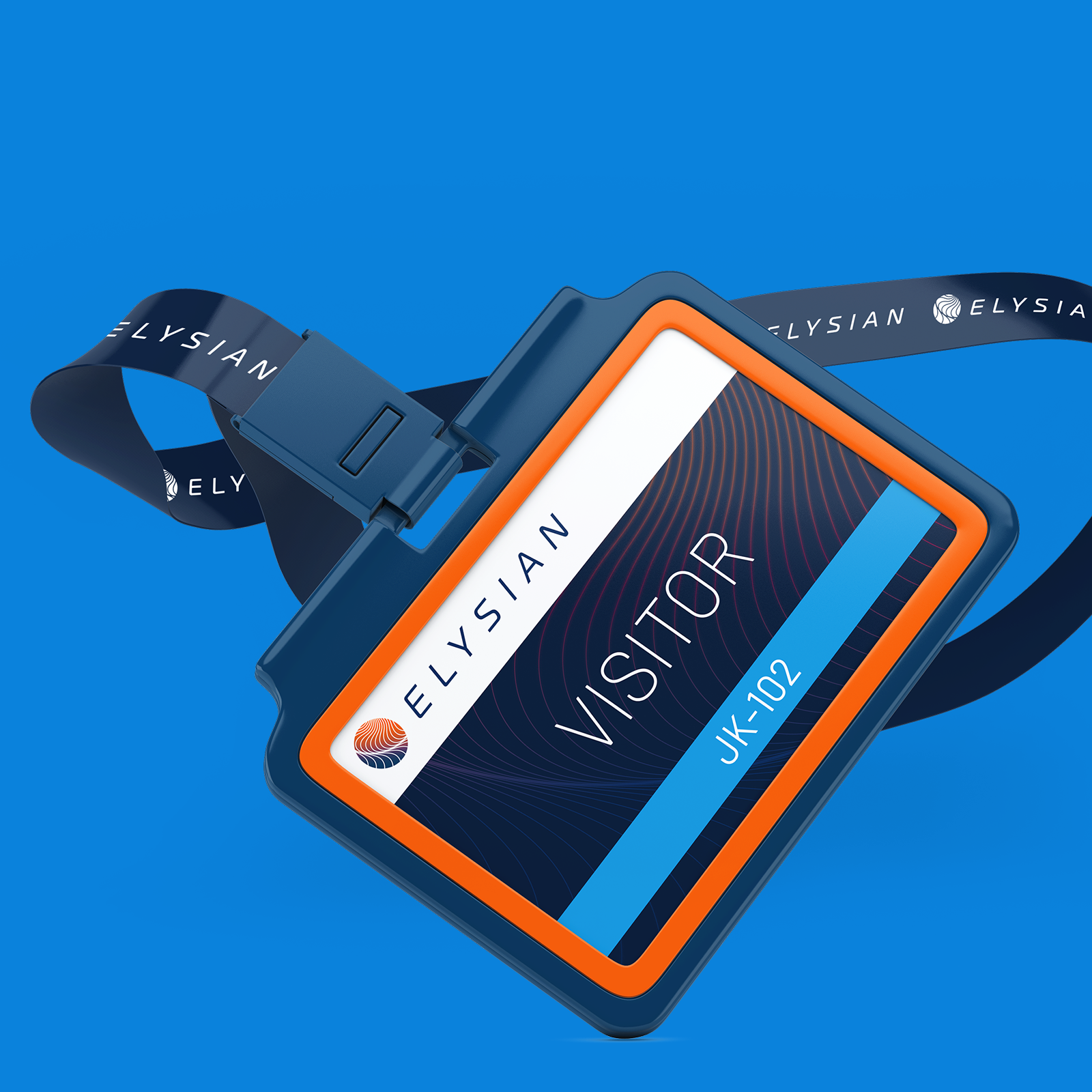
Solution: The logo mark visualizes a globe, alluding to long distance air-travel and also, as it is a somewhat traditional shape in this among competitors, garners trust through familiarity. Upon closer inspection you can see a pattern that suggest the rolling field seen from the sky, which not only alludes to the company name (Elysian fields) but also hints at the electric fields, which lie at the scientific core of electrically powered flight.
The field is made up of a lines, the curvature is derived from the shape of the capital F from the Fokker logo. Elysian mother company. In this way it connects to the deep heritage and experience on which Elysian technology is built.


Credits
Brand strategy: Martijn Rijven & Niek van Lonkhuyzen
Art direction, design: Martijn Rijven
Project lead: Niek van Lonkhuyzen
Art direction, design: Martijn Rijven
Project lead: Niek van Lonkhuyzen
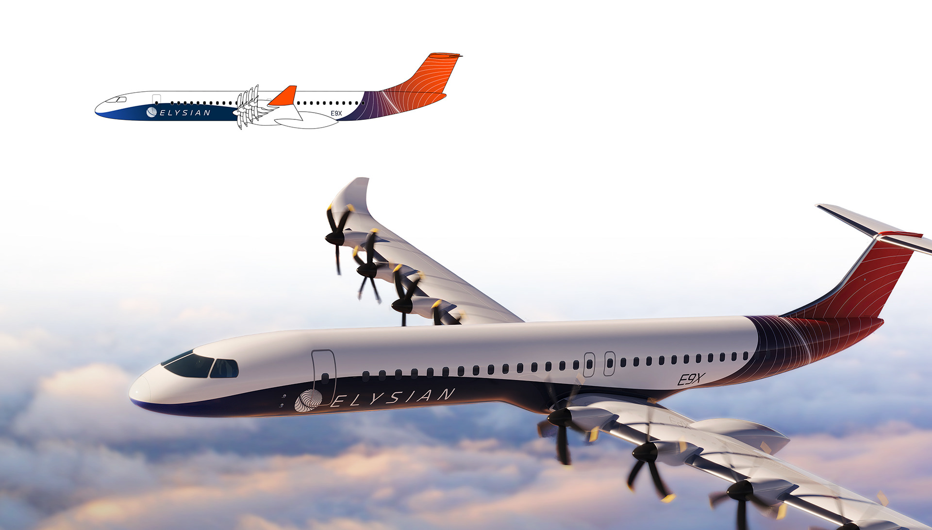
3D renders supplied by Marcel Schöningh