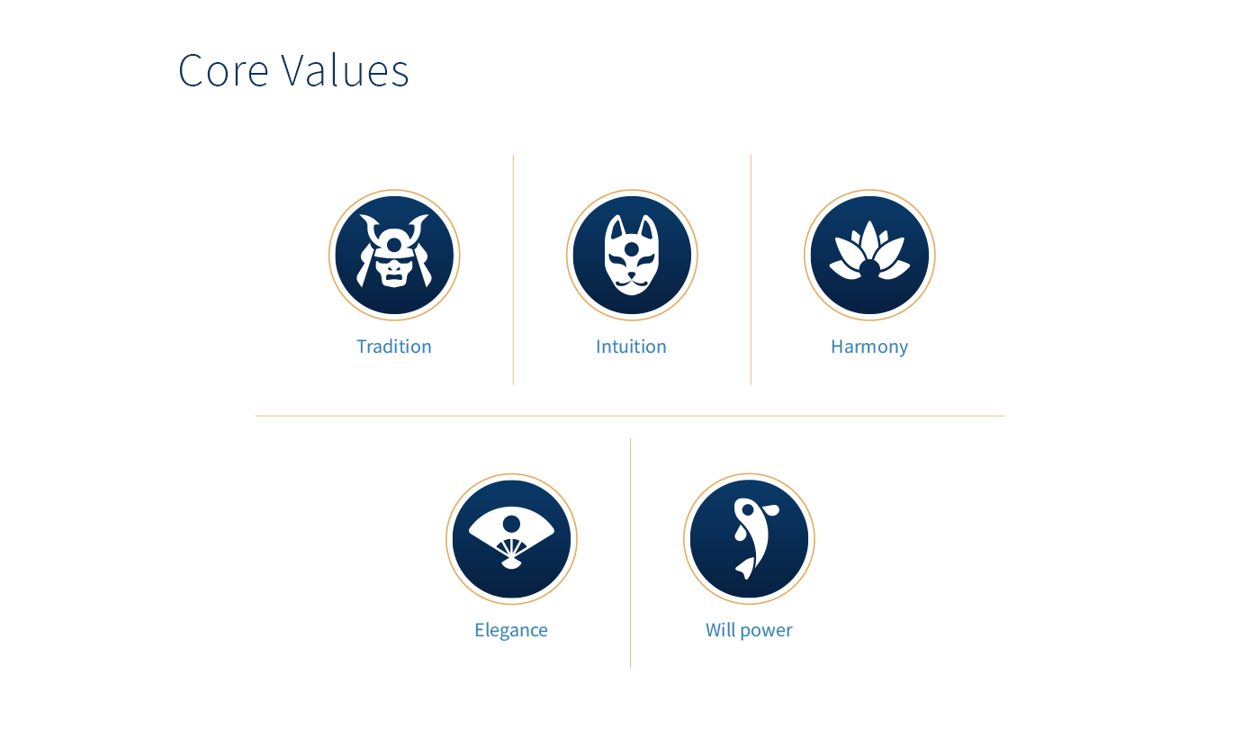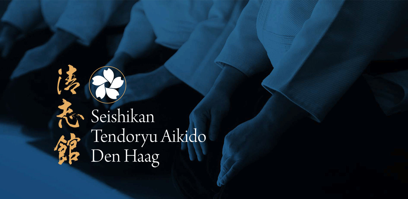
Although Aikido is a martial art, it is often also described as a form of physical meditation. Movement, breathing and mental focus are of equal importance in the practice of the sport. Seishikan Tendoryu Aikido is a dojo in the Hague that has a direct lineage in teaching the art of aikido to its founders in Japan. Steeped in tradition philosophy it is also a modern school with a welcoming group of teachers and an open minded approach to passing on this martial art.
These characteristics all needed to be represented in the visual branding of the school.
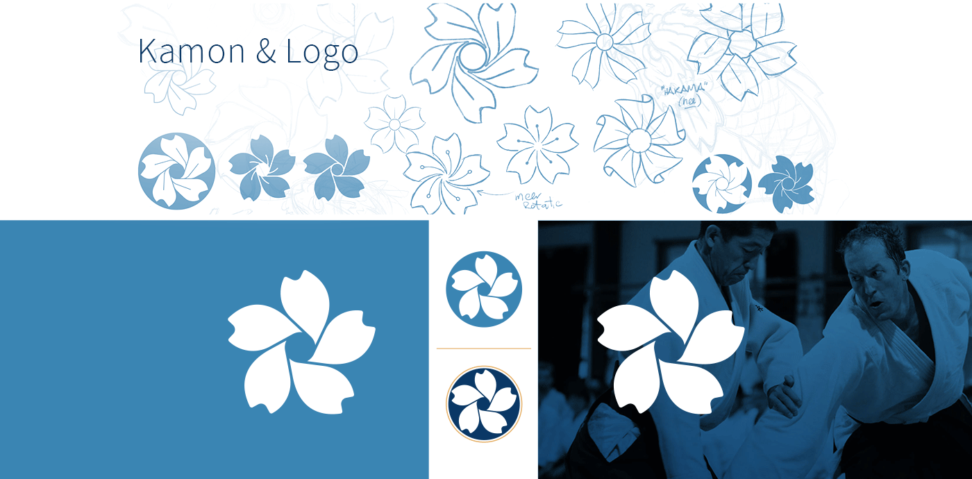
A challenge in creating the logo, was the need for it to incorporate the name in Japanese kanji and roman type plus the kamon. A traditional logo mark of sorts that was representative in ancient Japan for a specific clan or family.
The shape of the cherry blossom or sakura in this case was borrowed from the kamon of the global Tendoryu Aikido organisation which has three sakura. And the shape of it here represents the twisting / rotational movement that characteristic to this style of Aikido.
The driving reason for a re-brand was to attract more new members.
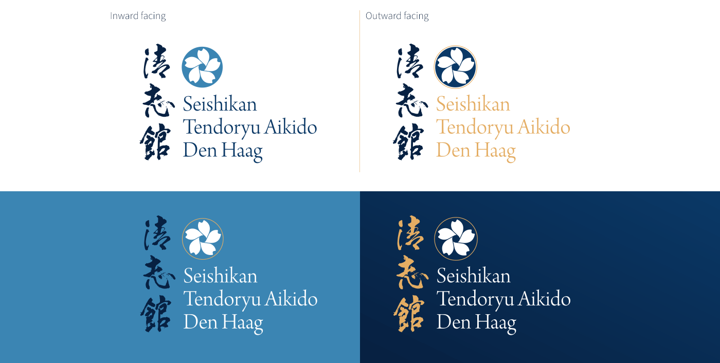
To stand out more amongst its competitors and still remain close to the dojo's more introspective approach to the sport, two closely related parallel styles were developed. One for internal communications and an outward facing one to serve a stronger marketing and promotional purpose.
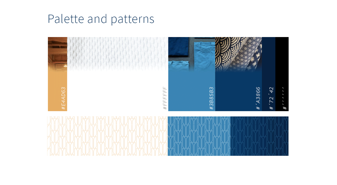
Inspired by various visual Japanese traditions a color pallet was put together that could both accommodate for both the internal as well as the outward facing visual communication.
And next to this pallet a series of patterns were design. The patterns was specifically based on the weave pattern as seen in the fabric of the 'Gi' the suit an aikidoka would use during practice.